Data does not speak for itself. See ways in
which data can illustrate the world.
Survey/Poll visualization
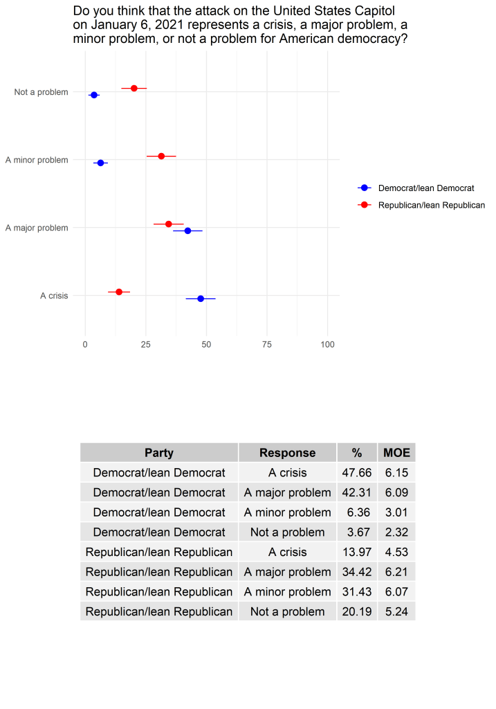
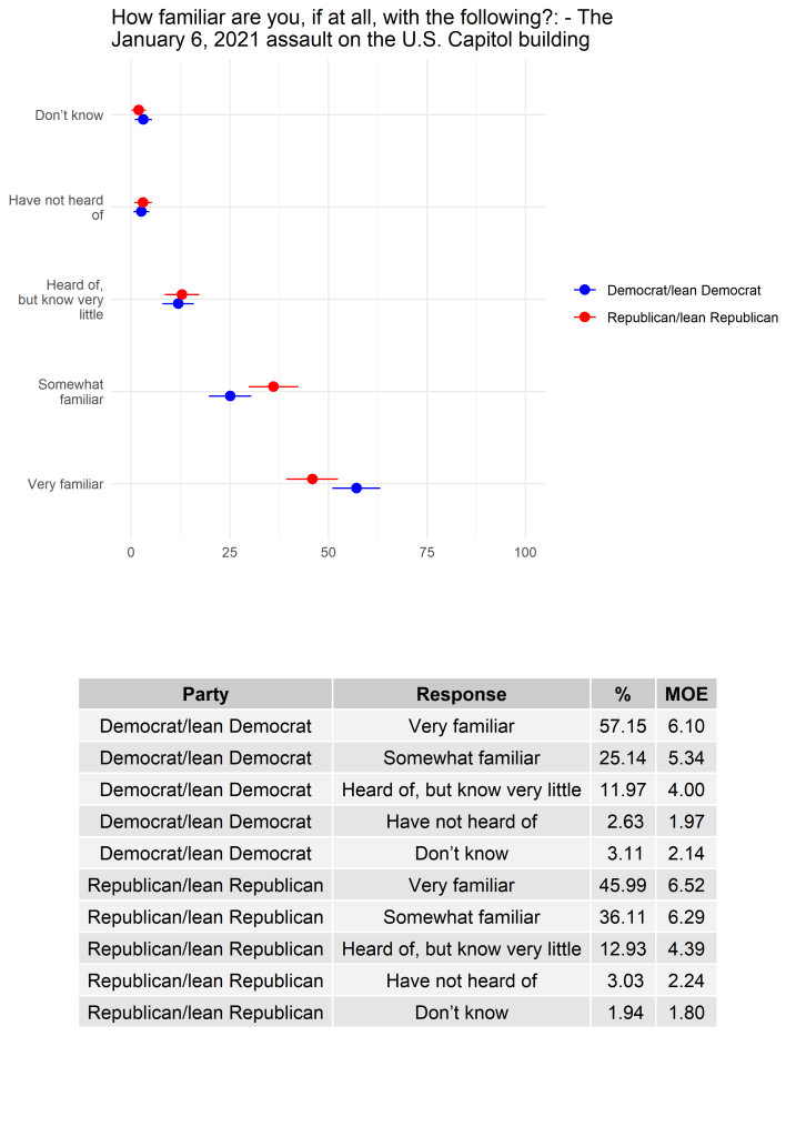
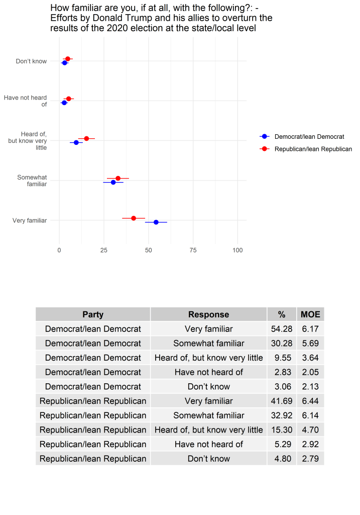
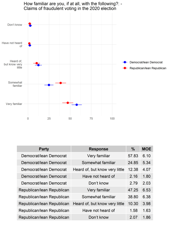
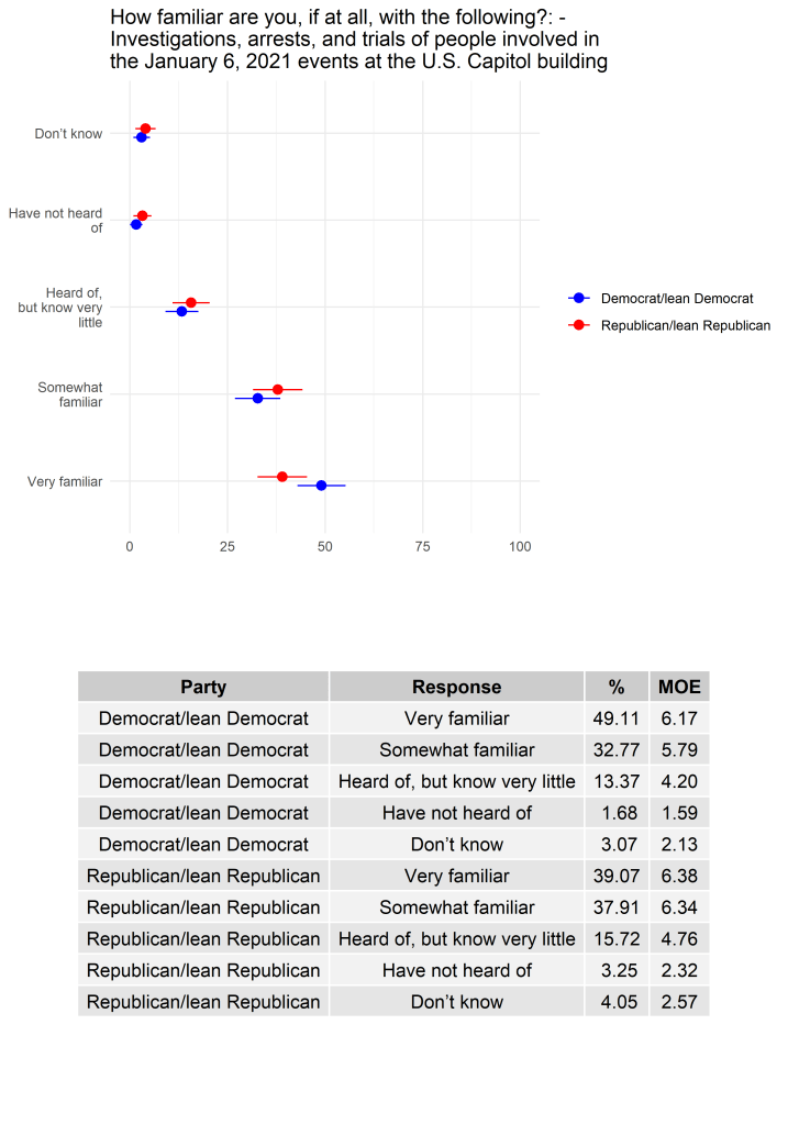
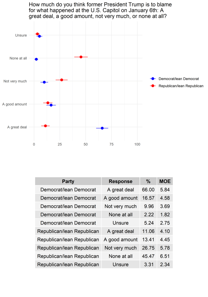
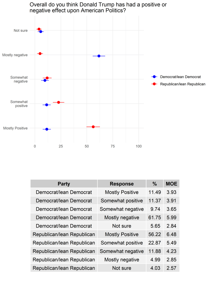
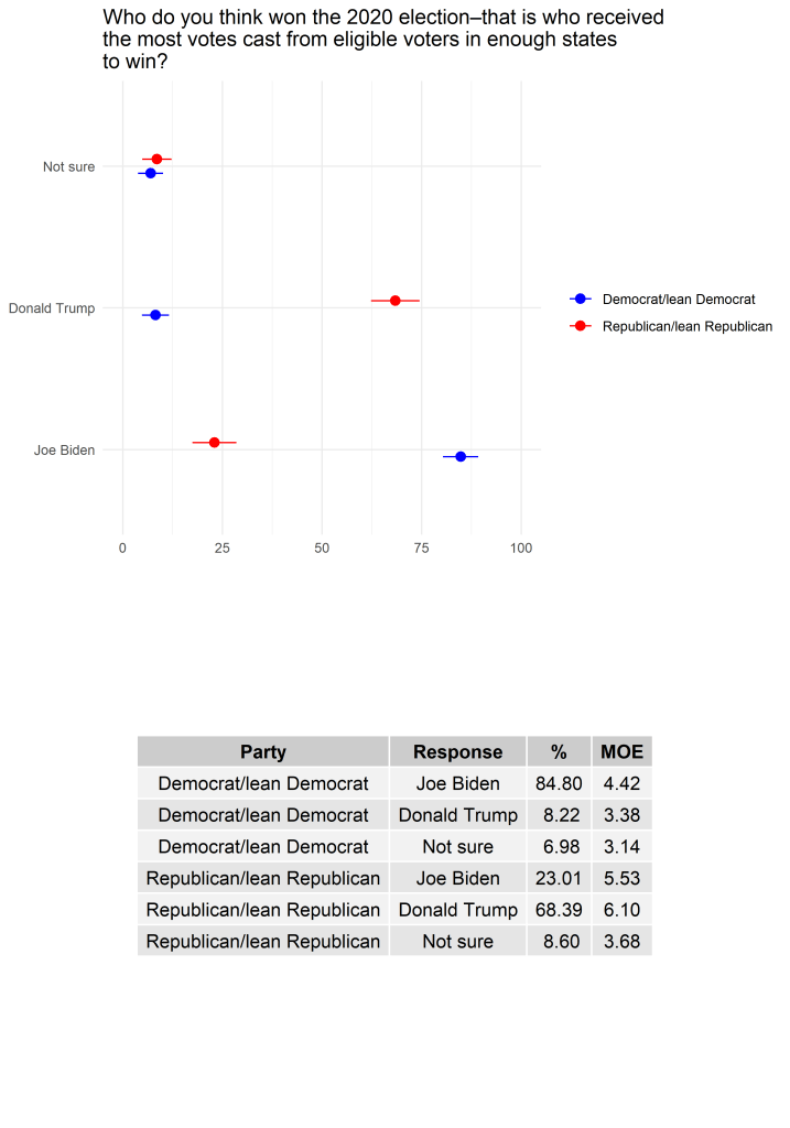
Visualizing polls and surveys expeditiously is crucial for any high impact research firm or university. The following are a sample from my collaborative Northern Poll project with Dr Robert Alexander and Dr Tyler Steelman. These cross tabs by party confidence interval plots and tables were all created via an automated R script, which acts as a template for all Qualtrics based polls. The full replication code can be found on my github repository here, and coverage of said poll here.
Election 2020
Healthy Elections
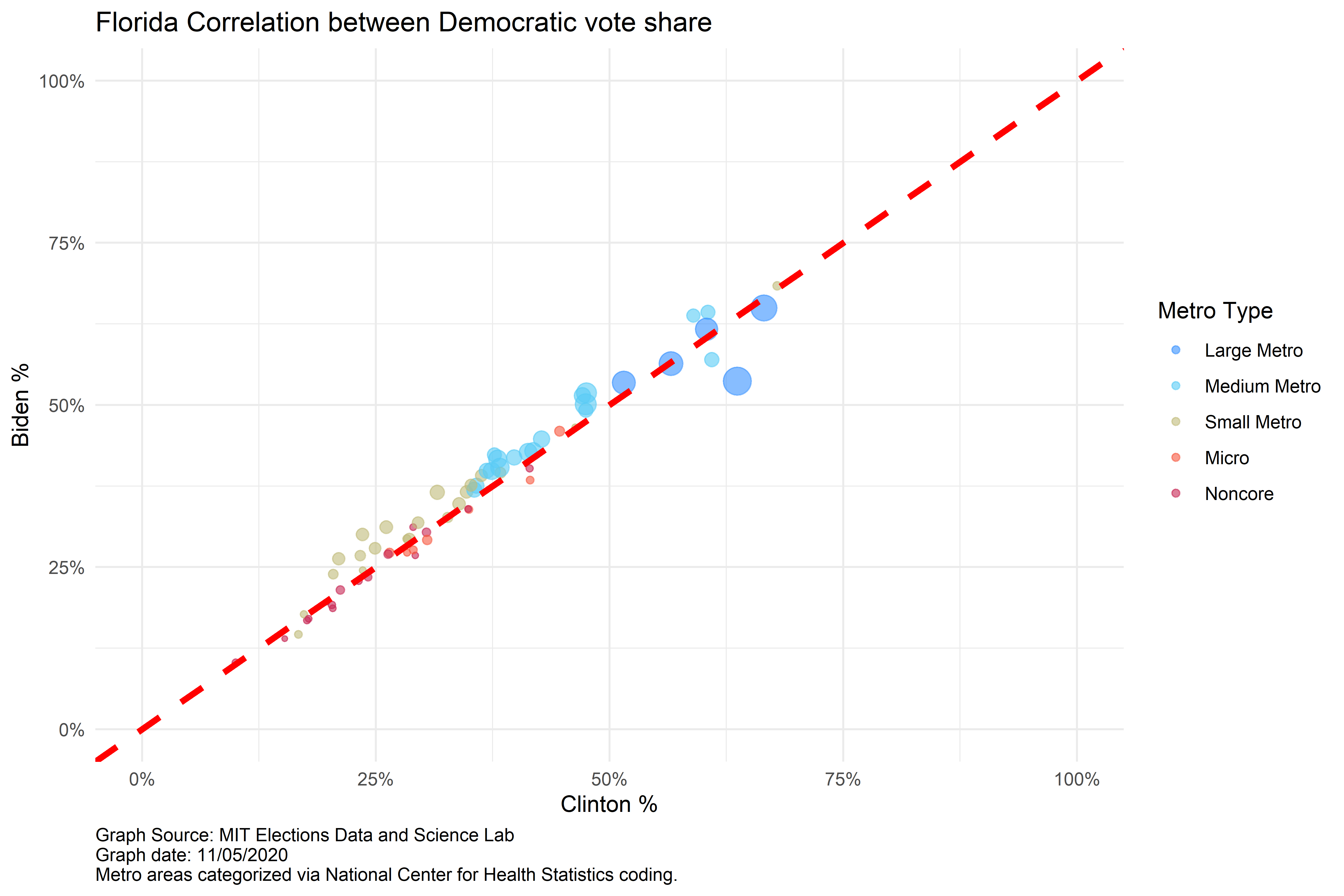
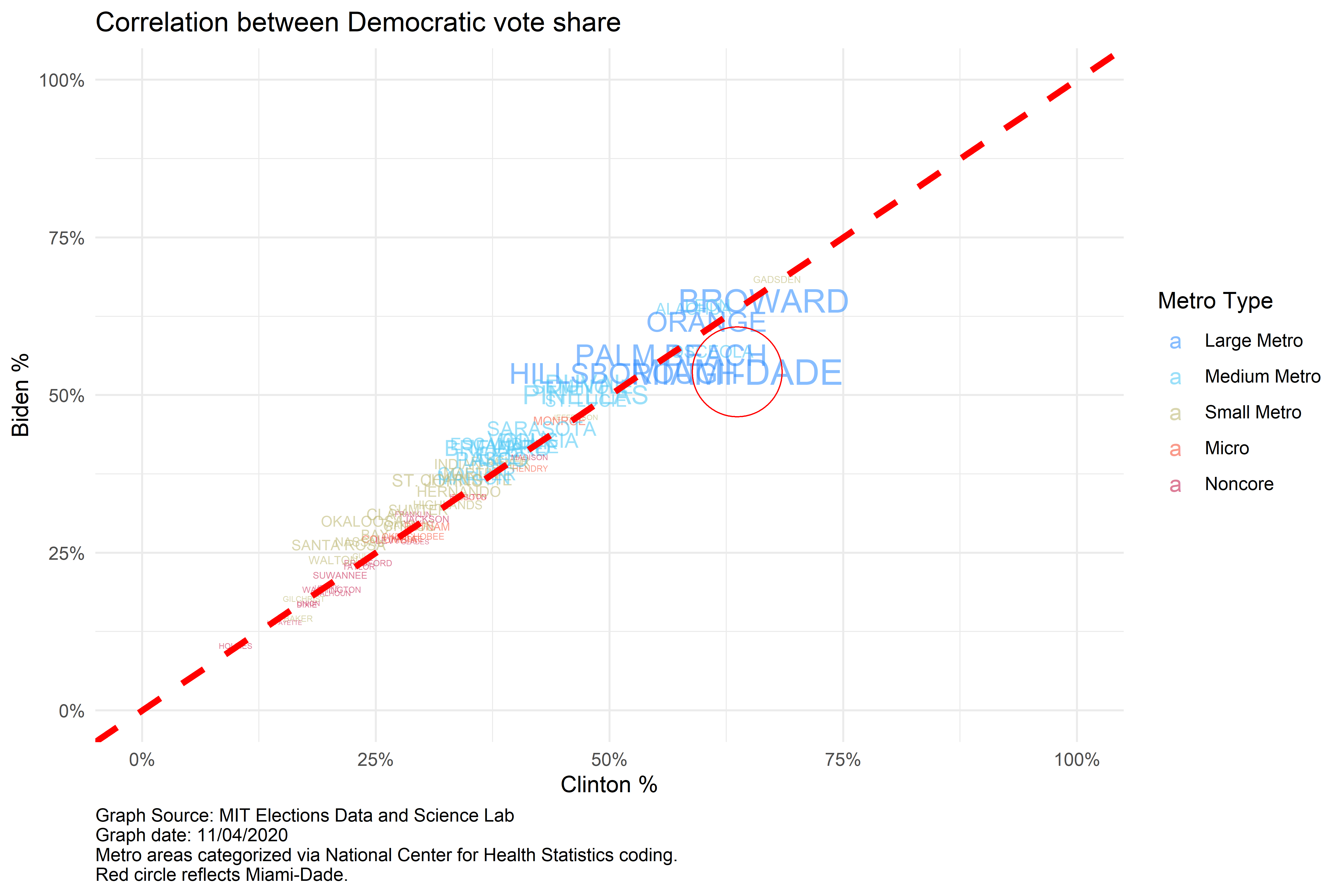
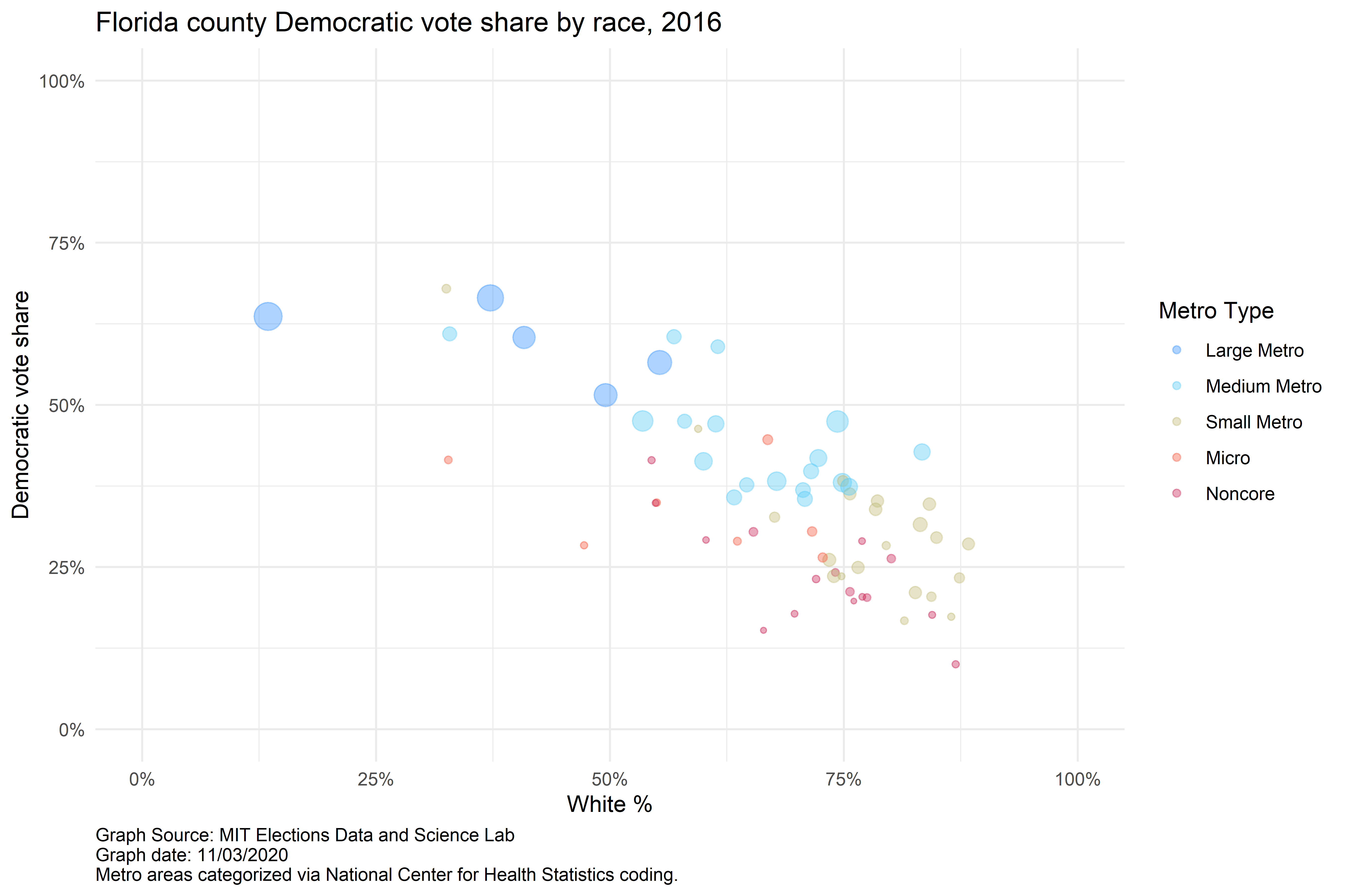
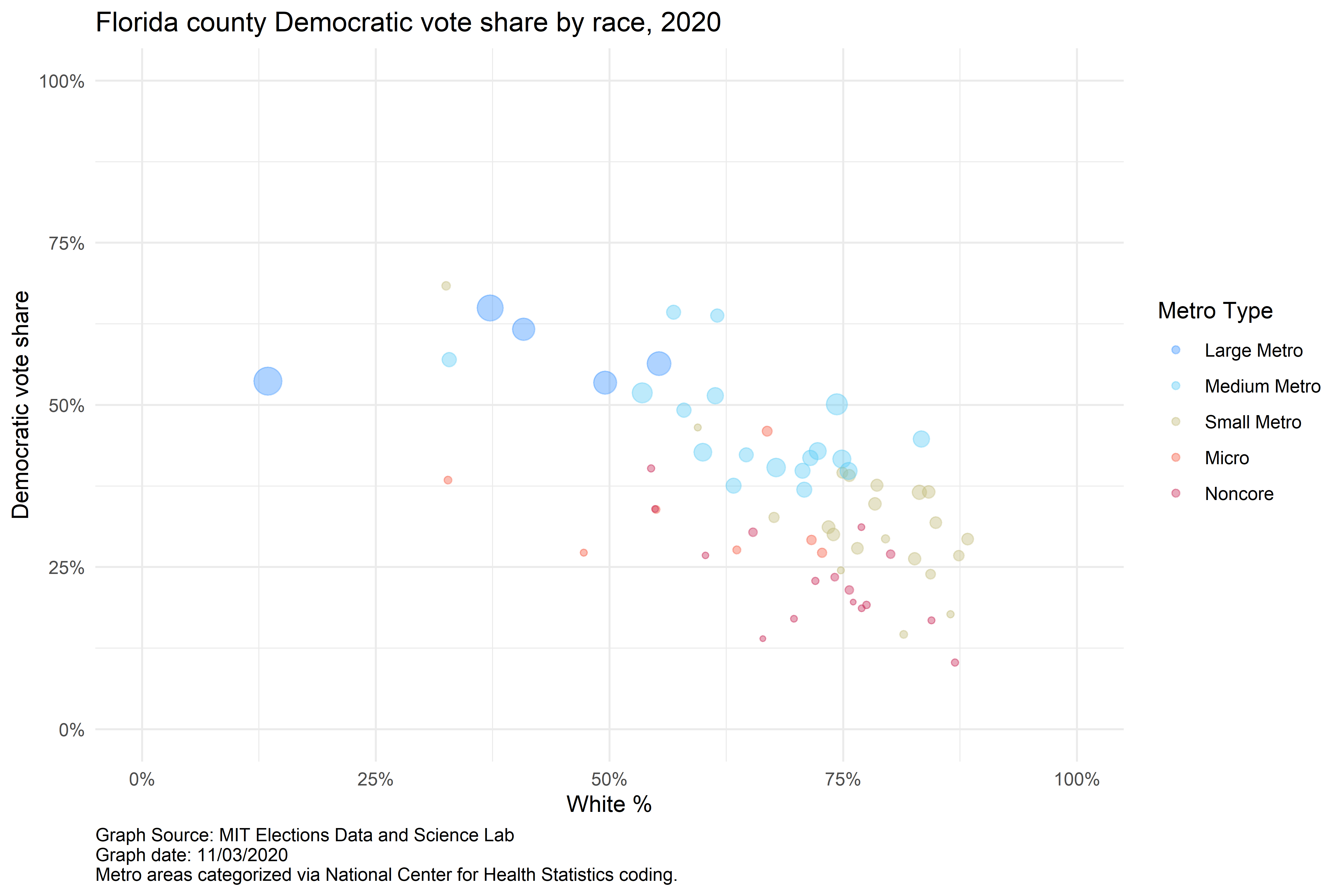
Florida
Florida proved one of the battleground states of the 2020 Presidential election. See how and where results shifted from the 2016 election by county and metro type.
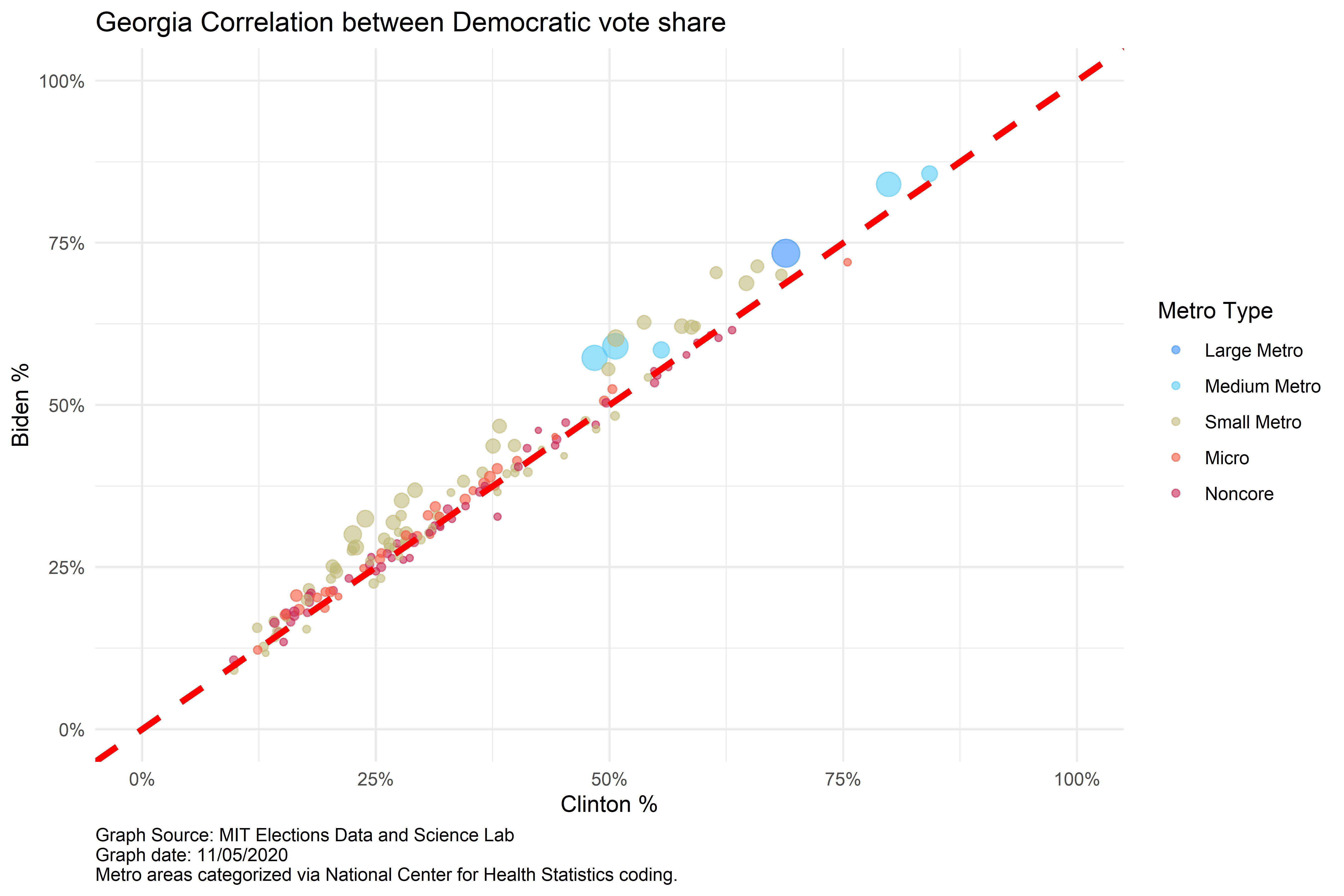
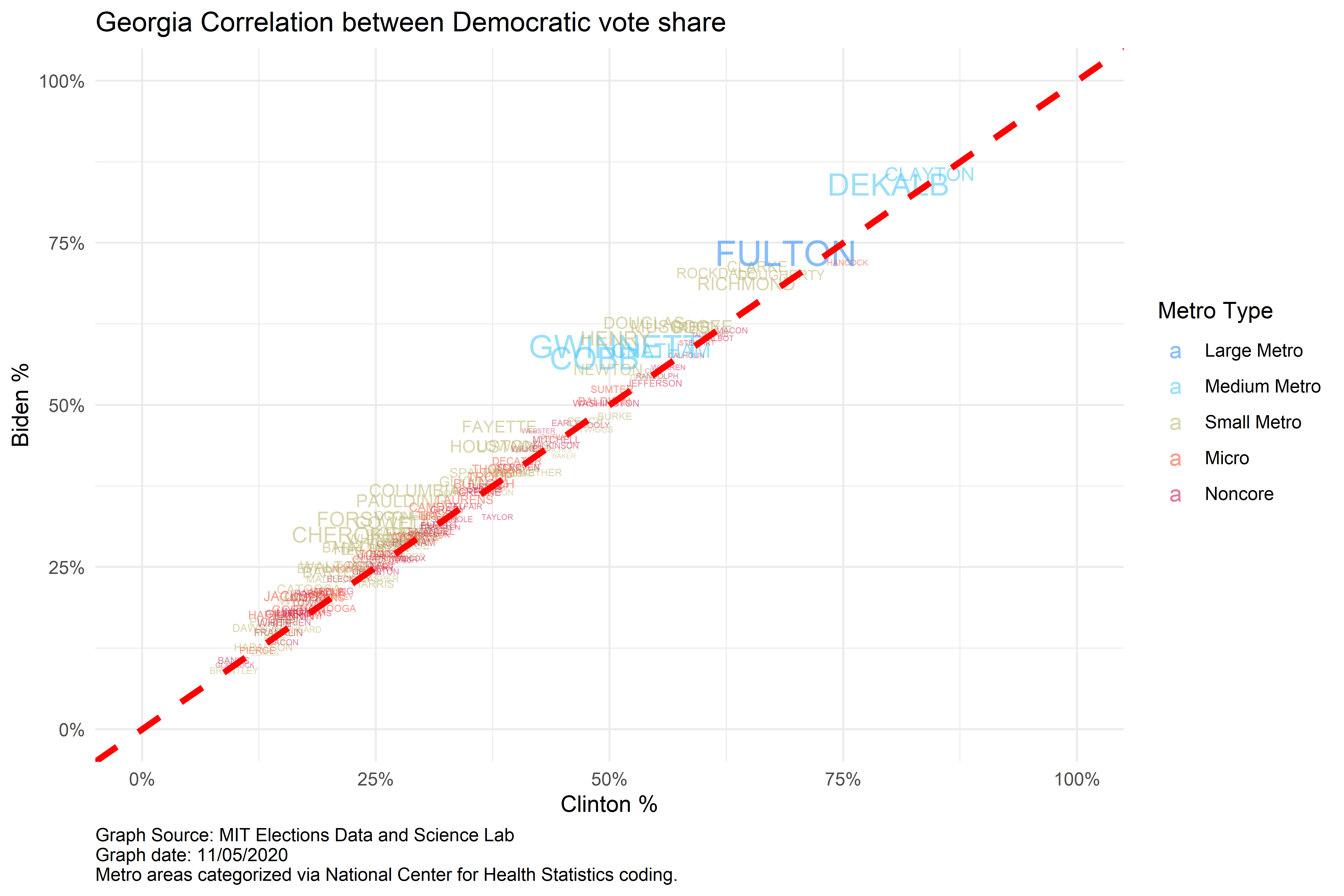
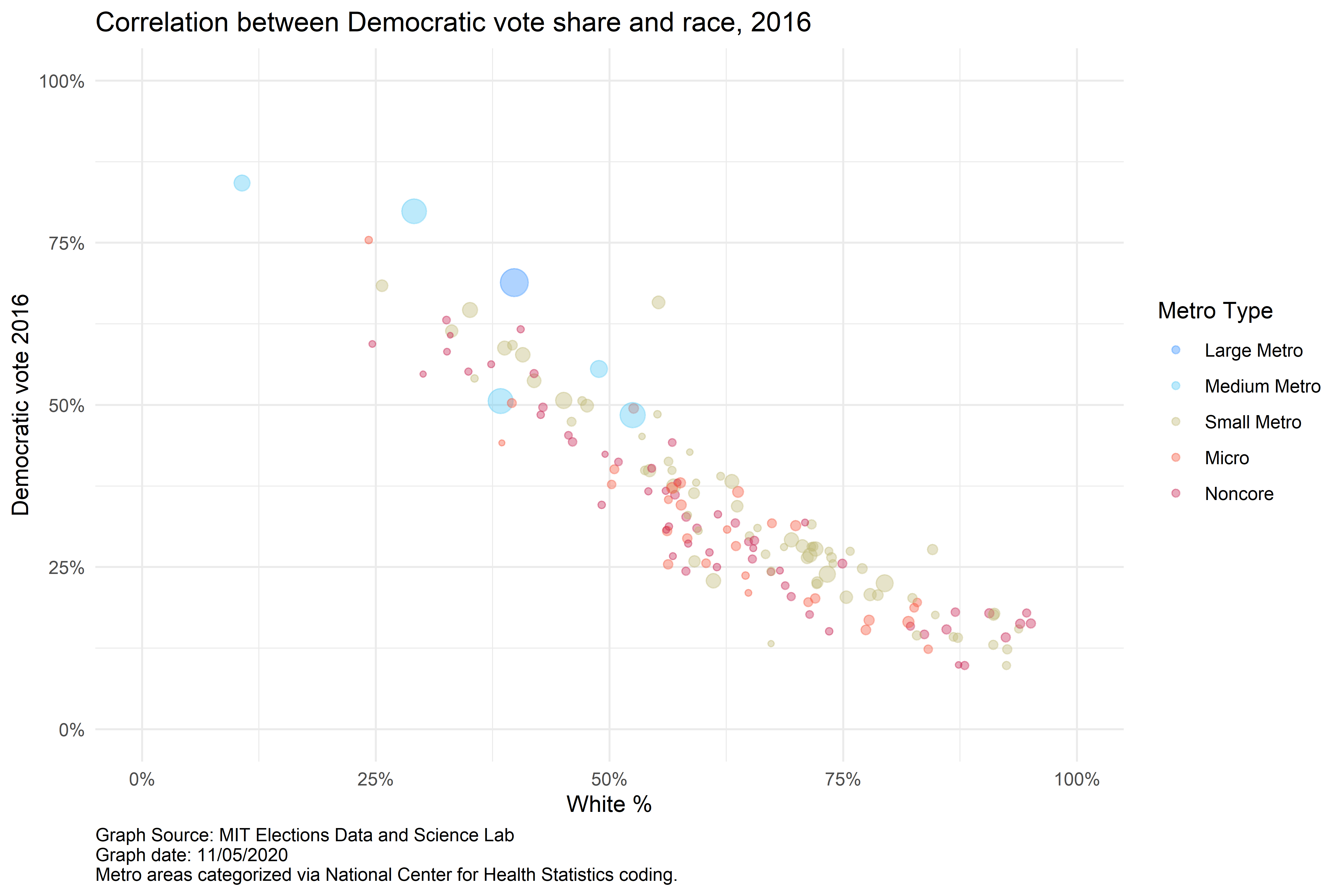
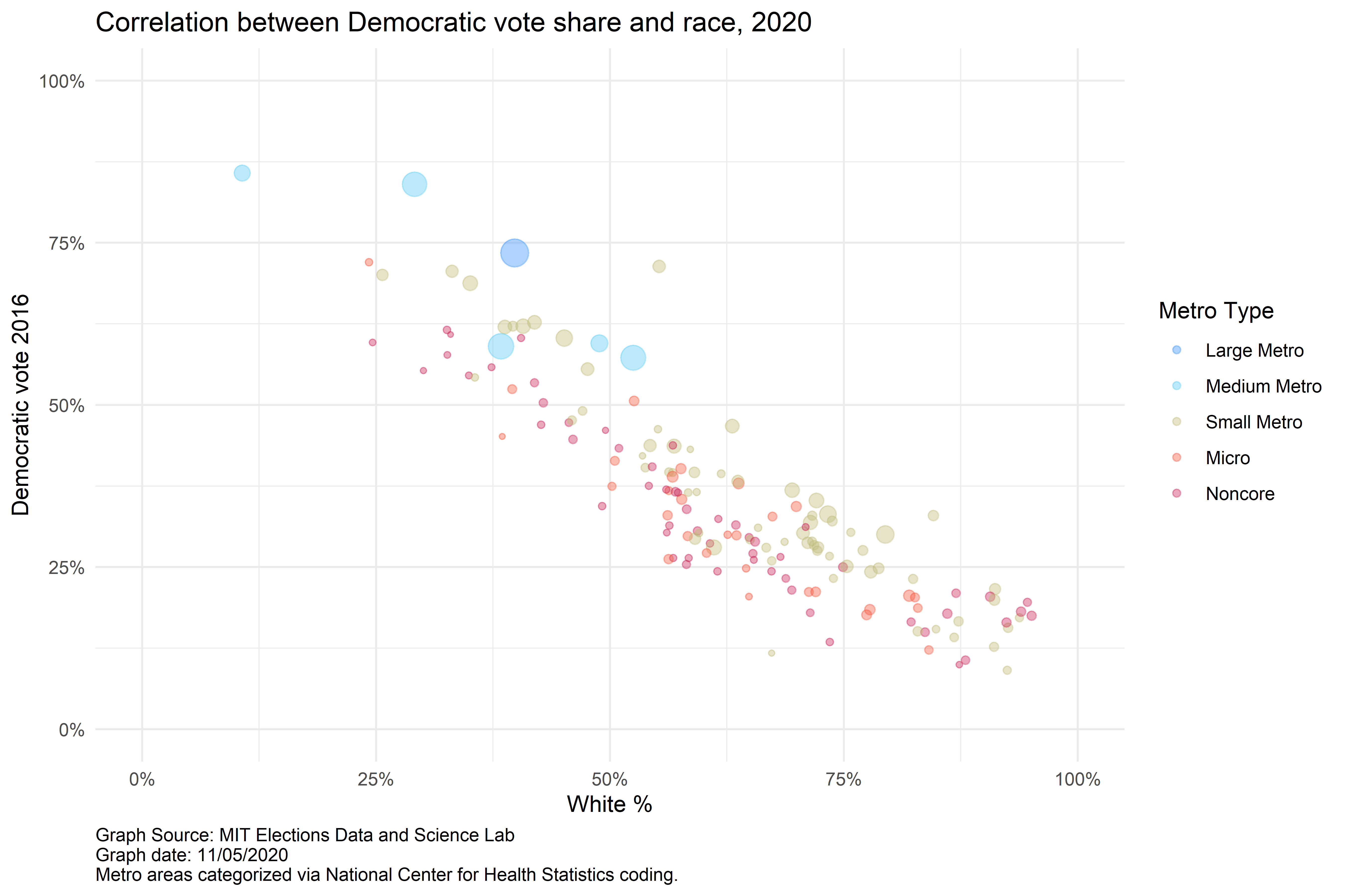
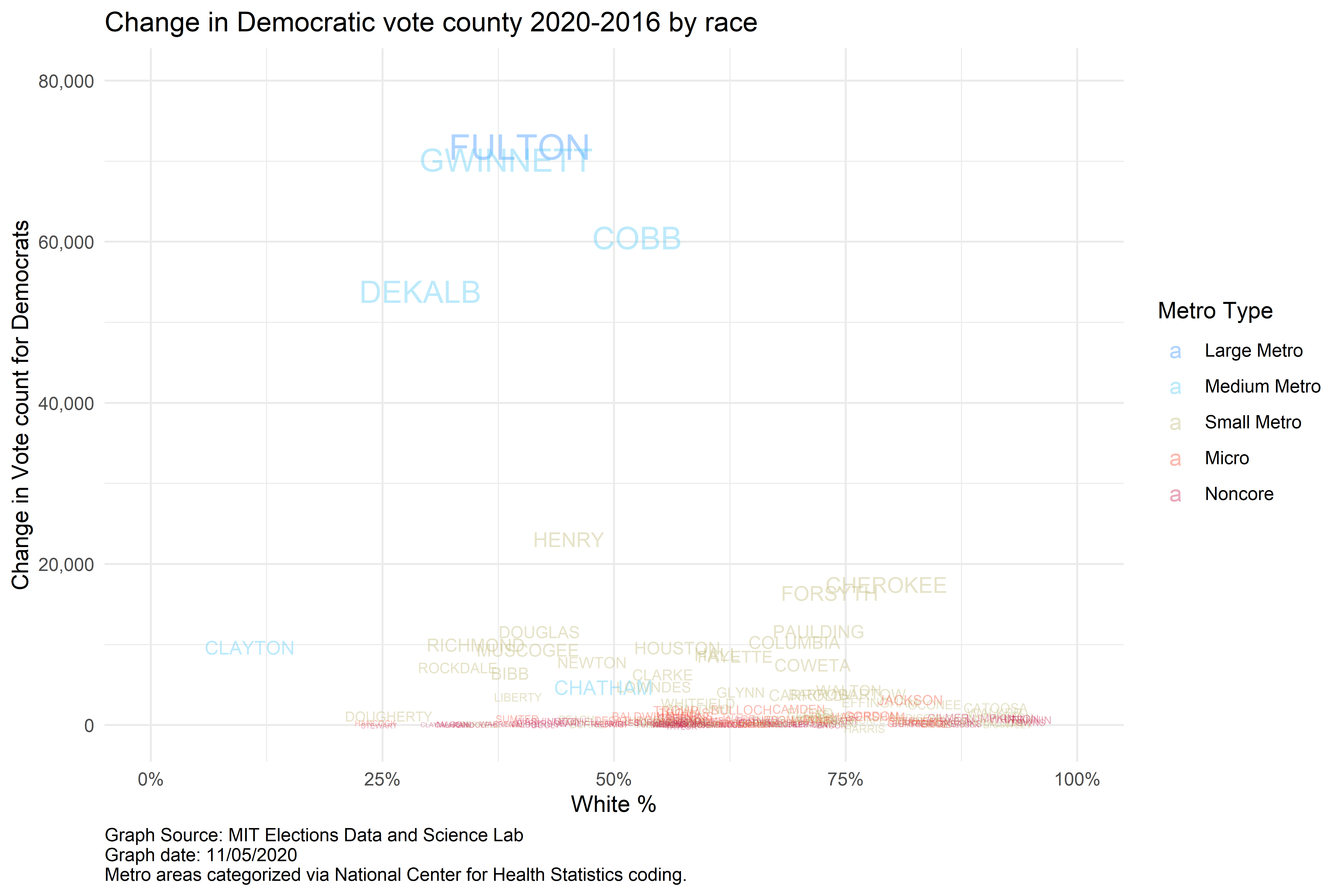
Georgia
Georgia caught the nation by surprise in swinging to Joe Biden during the 2020 Presidential election. See how and where results shifted from the 2016 election by county and metro type.
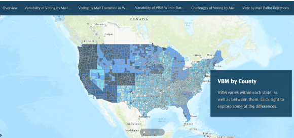
Voting by mail
Click here to see how story maps can be used to explain geographic trends of the shift to voting by mail in the United States.
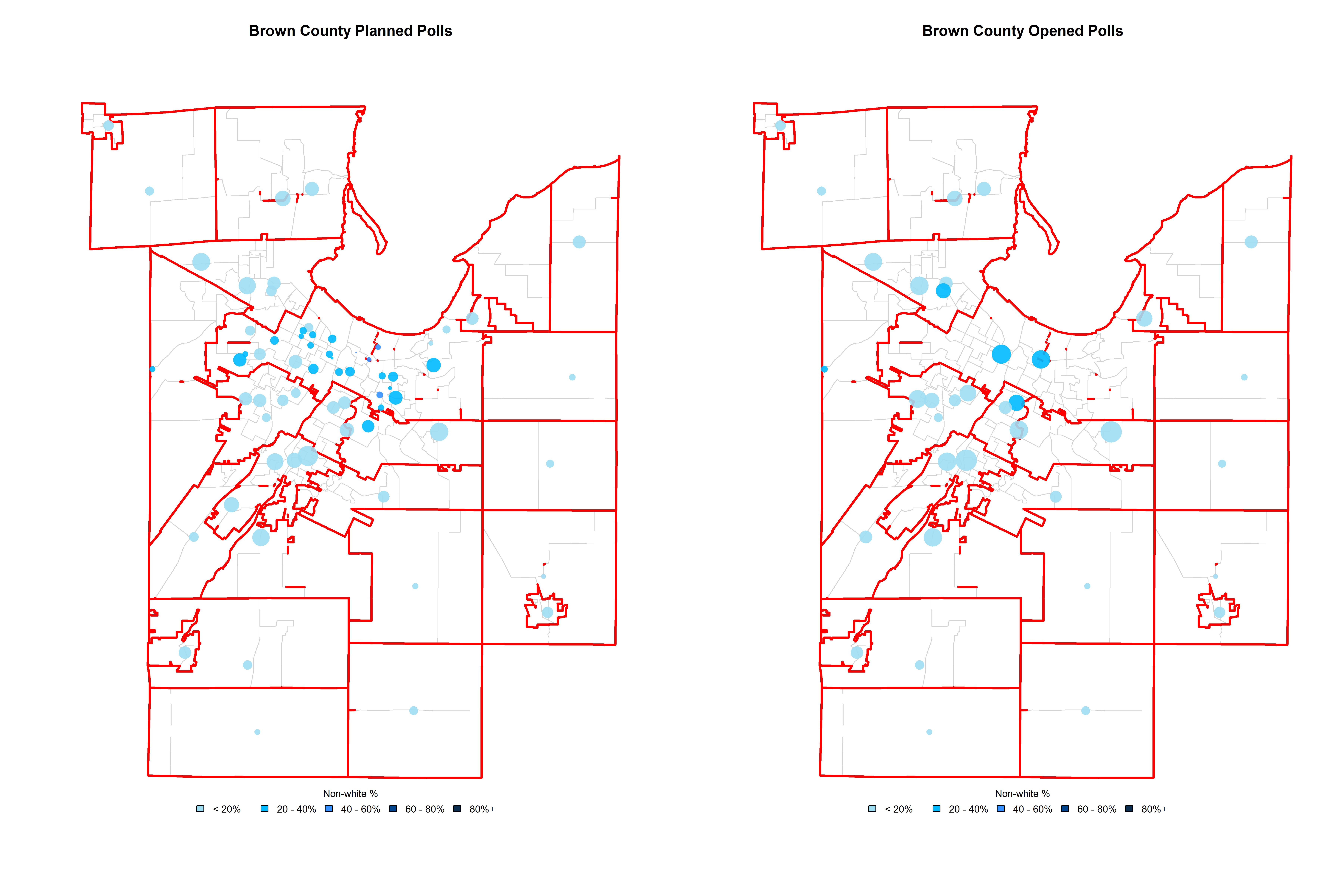
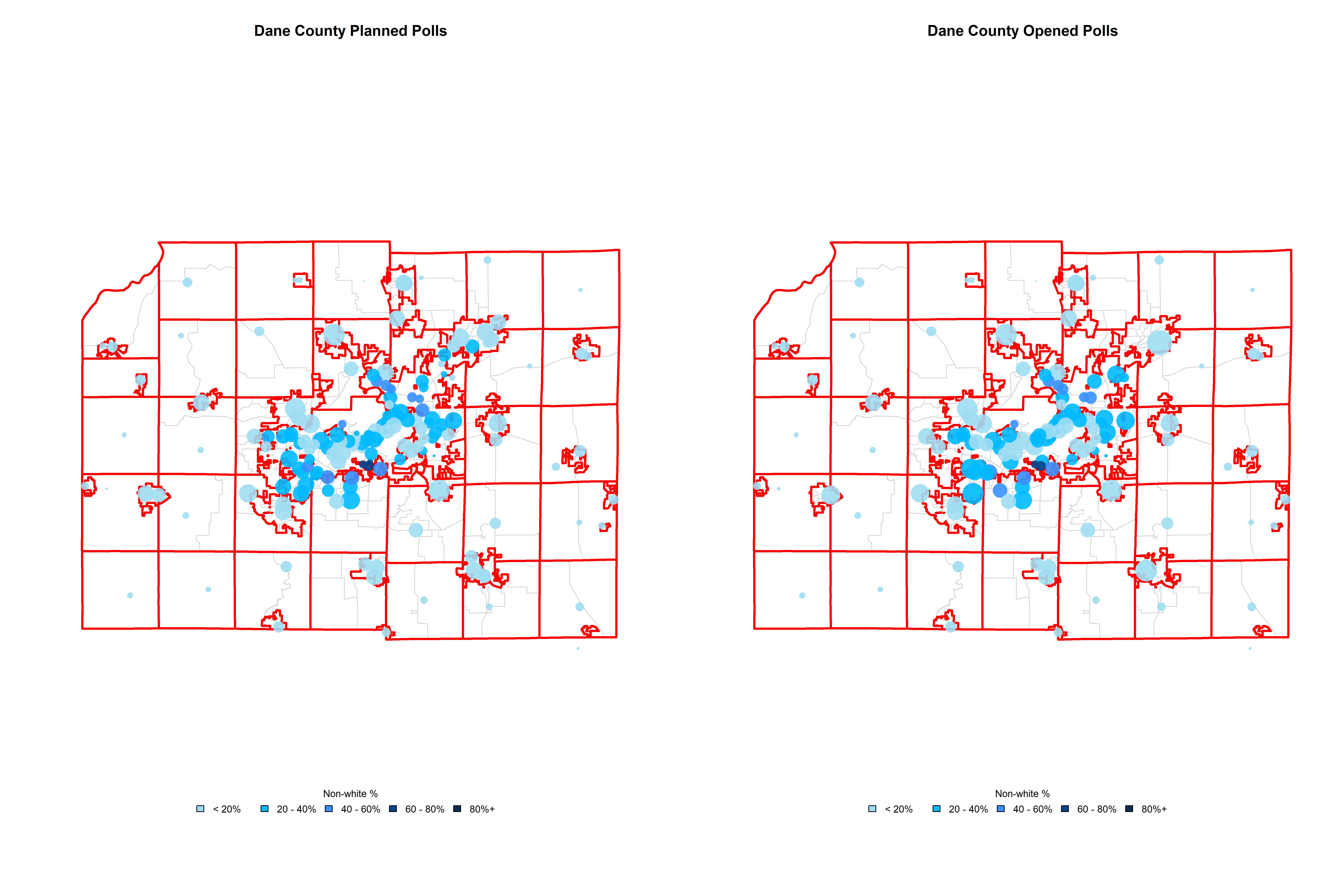
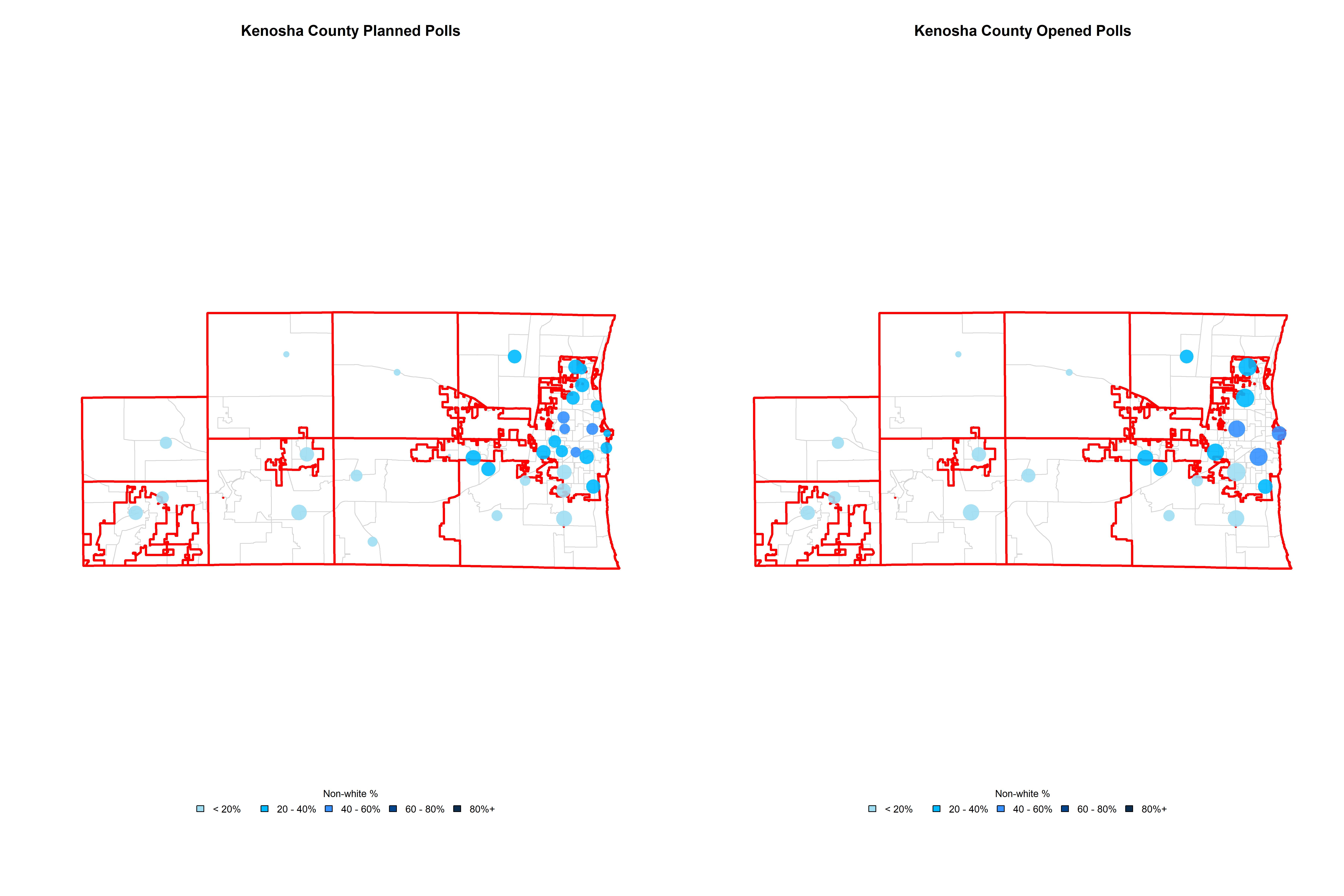
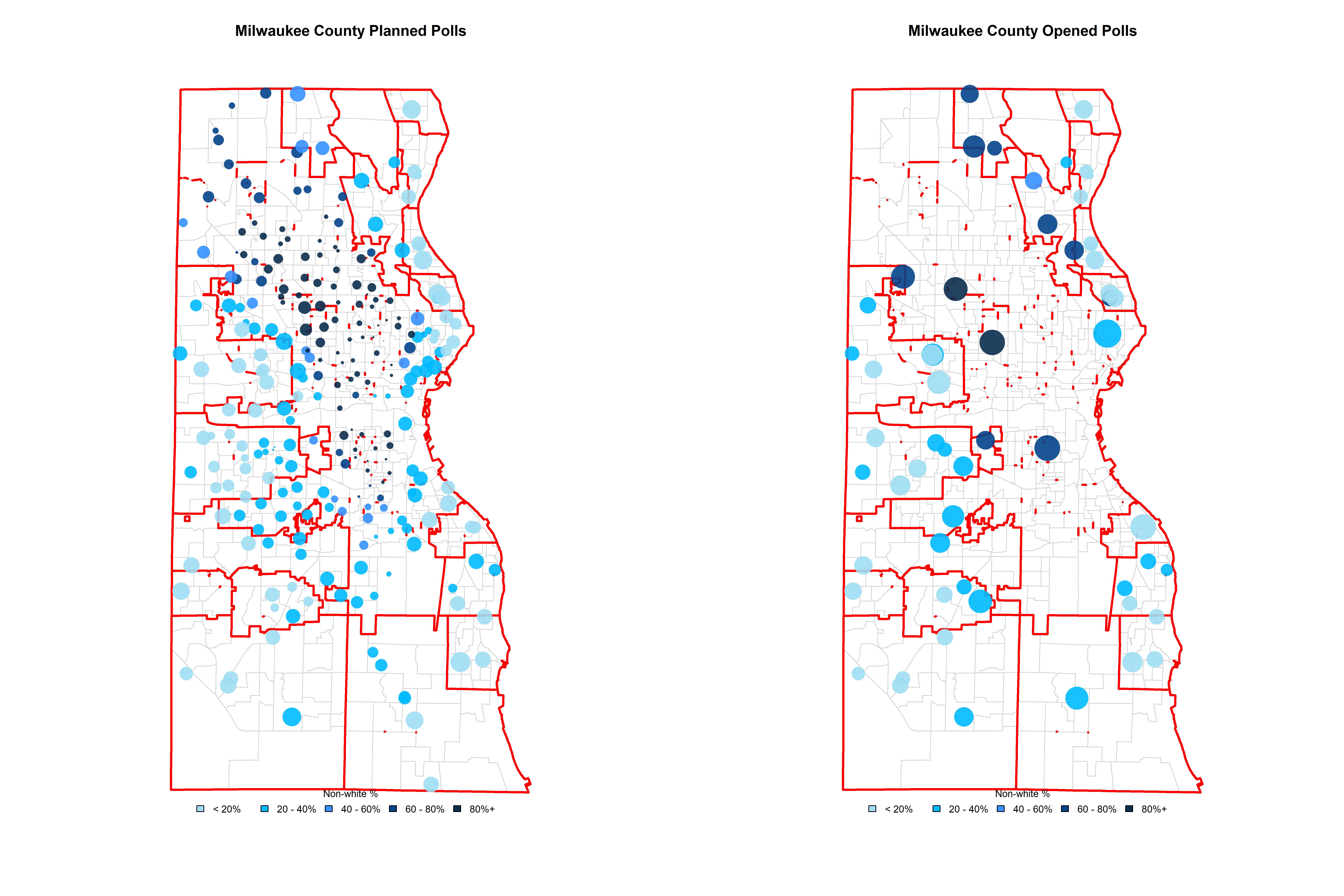
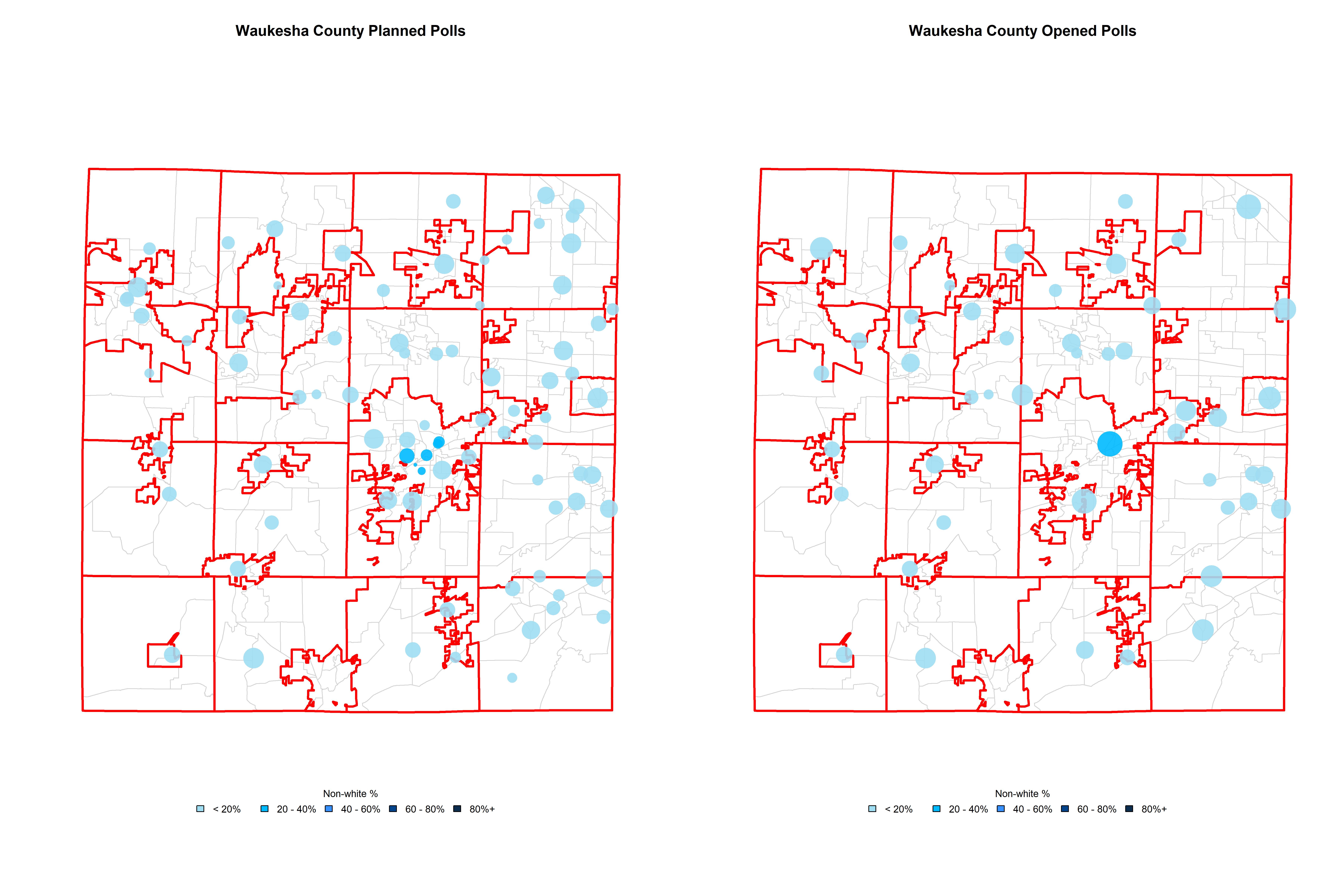
Change in WI polling places, April 7, 2020
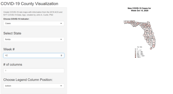
Mapping COVID-19
COVID-19 proved one of the greatest electoral and public health threats in U.S. history. See the spread of COVID-19 across the U.S. here.
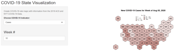
Click here for a visualization of the spread of COVID-19 by U.S. County.
Areal Interpolation
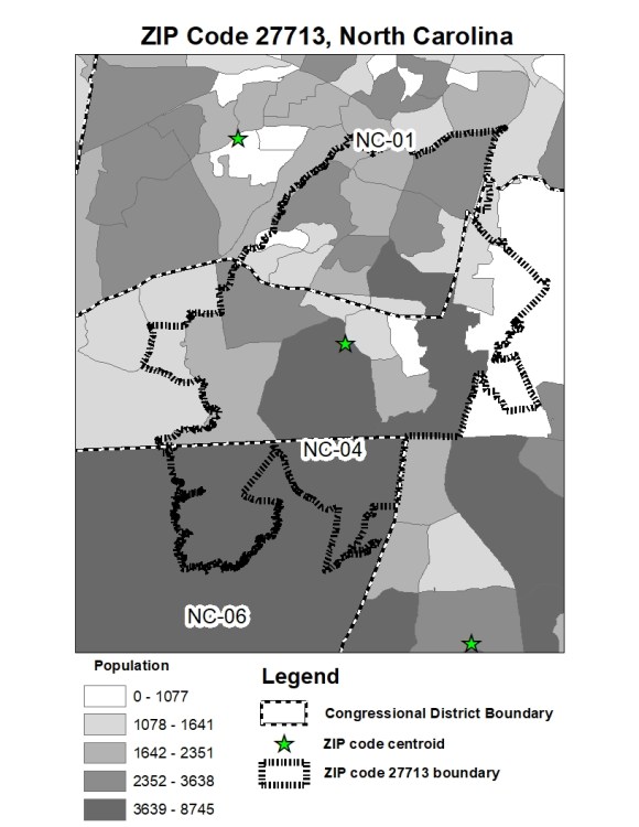
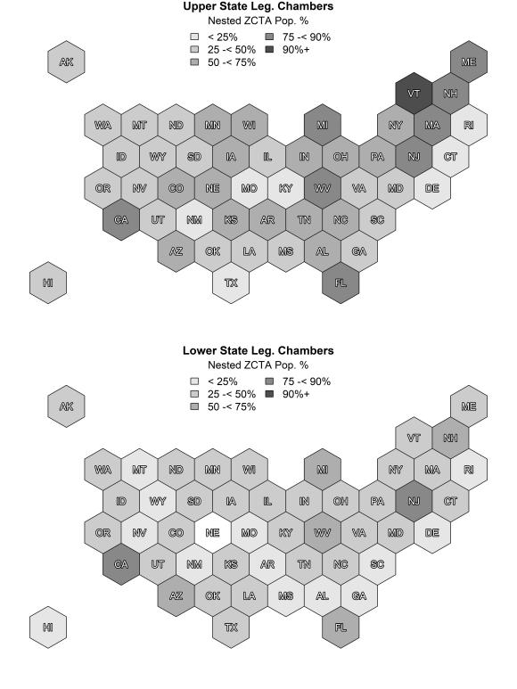
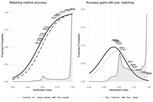
Areal interpolation problems arise when geographic units do not perfectly nest within each other. Slide through and see the nature of areal interpolation problems as applied to U.S. ZIP codes and legislative districts, along with the degree of overlap necessary to have confidence in matching individuals to different levels of geography (Steelman and Curiel, 2023).
